25 Gestalt Principles
There are some formal theories or methods which can help with understanding how and why data visualisation works in a broad sense. Two useful frameworks are gestalt principles and pre-attentive attributes
Gestalt Principles
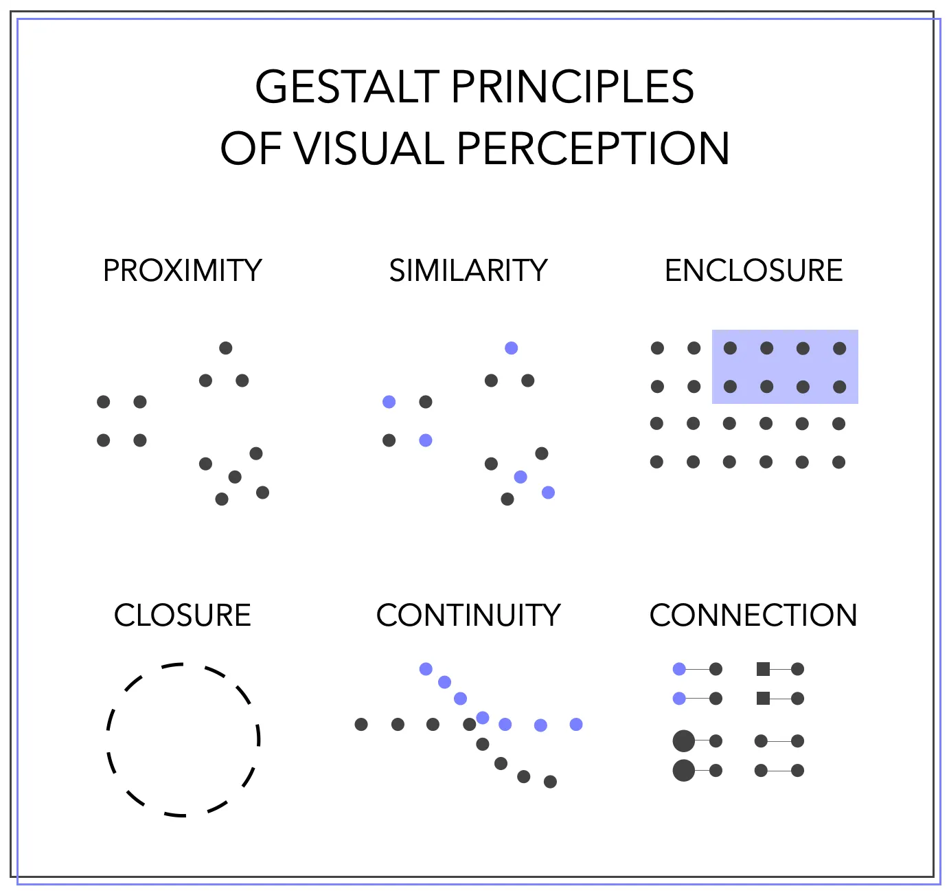
Gestalt principles were developed from the late 1800s and could be considered part of the discipline of psychology and philosophy. Gestalt principles are related to perception: the basic theory is that we perceive visual forms as a whole, rather than each part separately.
In other words, we simplify our visual stimuli in order to make sense of what we are seeing, and the wider world.
The developers of Gestalt boiled this down to a series of principles, which they say govern how we do this simplifcation. The data visusalisation types and default settings we use naturally use these principles - we don’t need to actively think about them most of the time. However, it’s worth understanding them to have some kind of theory as to why data visualisation works.
The principles which apply particularly to data visualisation are:
Proximity
Similarity
Enclosure
Closure
Continuity
Connection
Proximity
When objects are placed close together, our mind intuitively infers a connection between them.
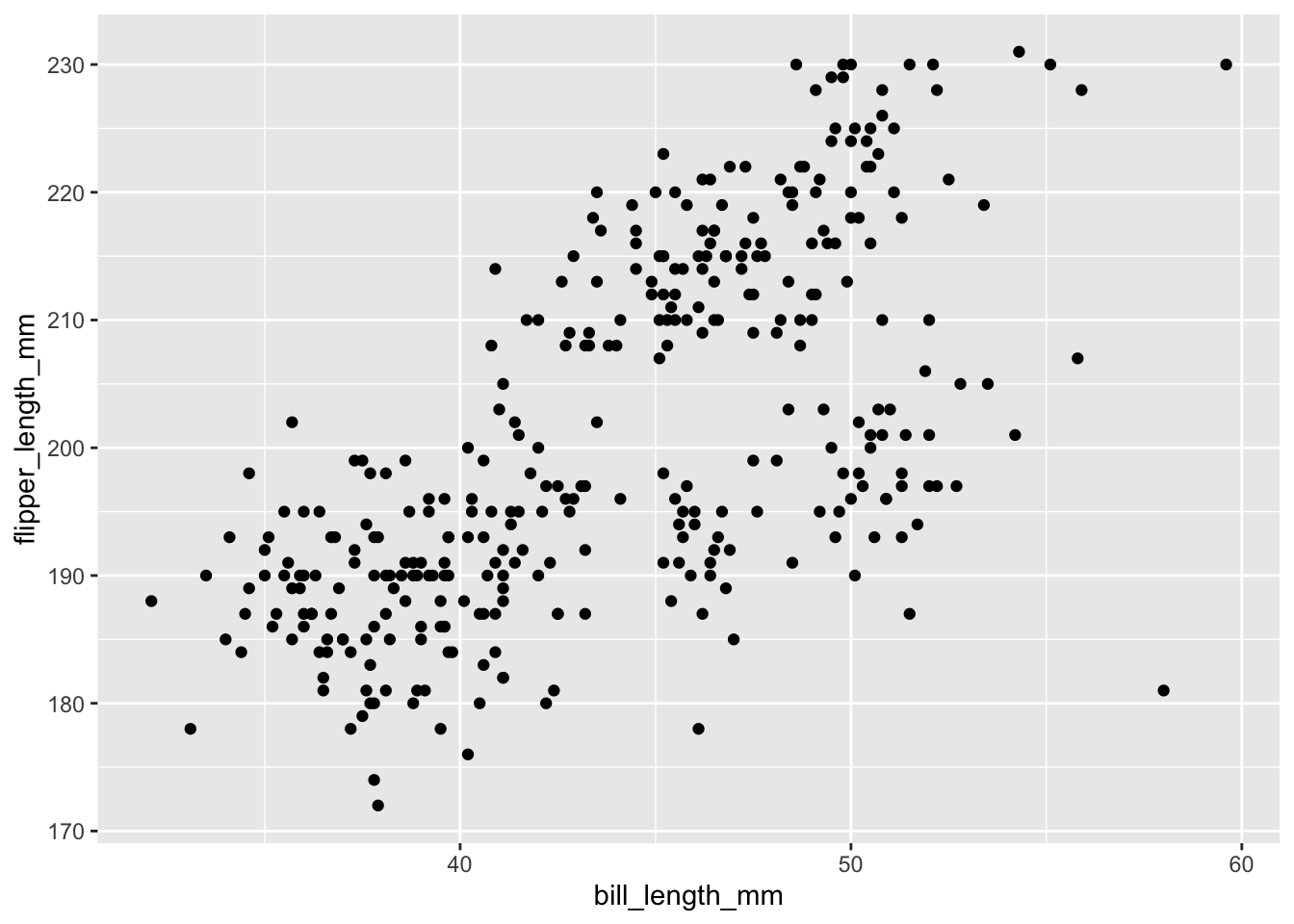
Take this scatterplot, which visualises the relationship between bill length and flipper size in a dataset of penguin observations.
Something we might notice is that there are roughly three clusters of points which are closer together than they are to the other clusters. We intuitively realise that there is some significance to these points being placed close together (in this case, each cluster represents a different species of penguin).
In more general terms of design, it can also be useful to think about proximity - different elements of charts should be close together, such as labels and legend.
Similarity
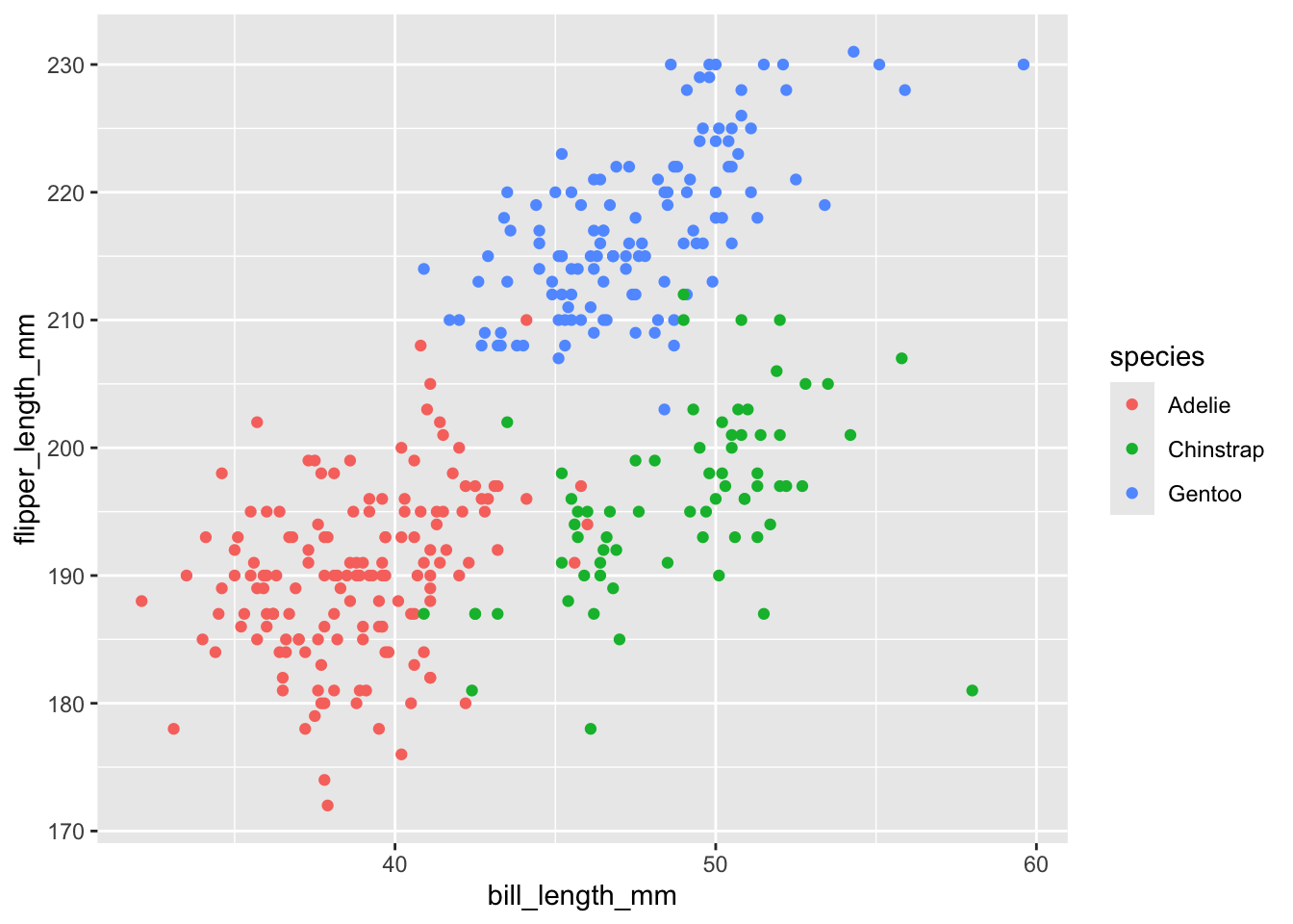
This principle states that objects which are a similar (or the same) size, shape or colour will be perceived as part of the same group. This is a very useful way to draw attention to significant groups in our data. If we add colour to the previous example, the distinctiveness of the species is even clearer:
Enclosure
This principle says that objects within the same border will be perceived as a group. Again, this can be exploited in data visualisation to highlight groups within our data.
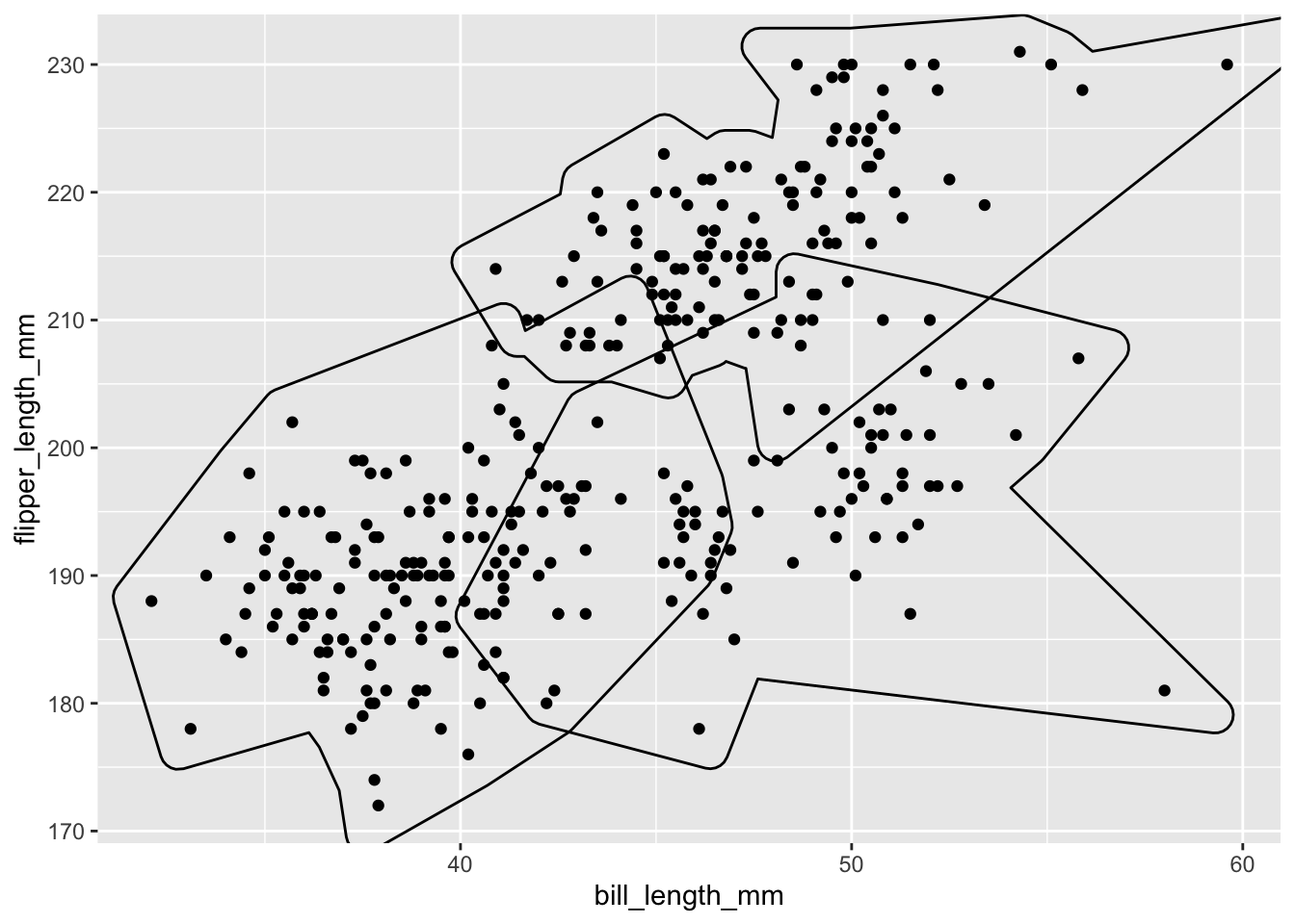
We’ll learn how to add these kinds of things in a future class.
Closure
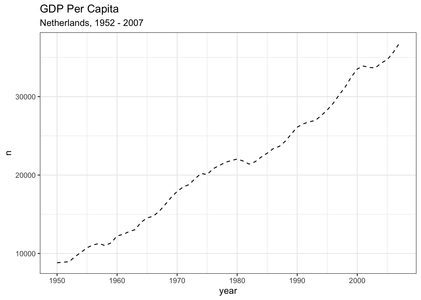
Closure is the principle that we tend to ‘close’ unfinished objects to make them whole. This is perhaps not used as much as some of the others in data visualisation, but, for instance, we can think of the way in which we perceive dashed lines as a solid line:
Continuity
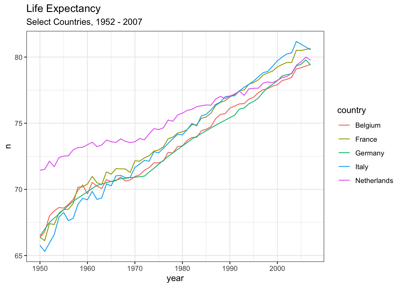
This principle states that we naturally try to organise objects when they are placed one after another. The obvious use of this is in graphs showing change over time. When drawn as lines, we make the natural assumption that the objects (in this case, position on a graph) are in a sequence and are related to each other.
Connection
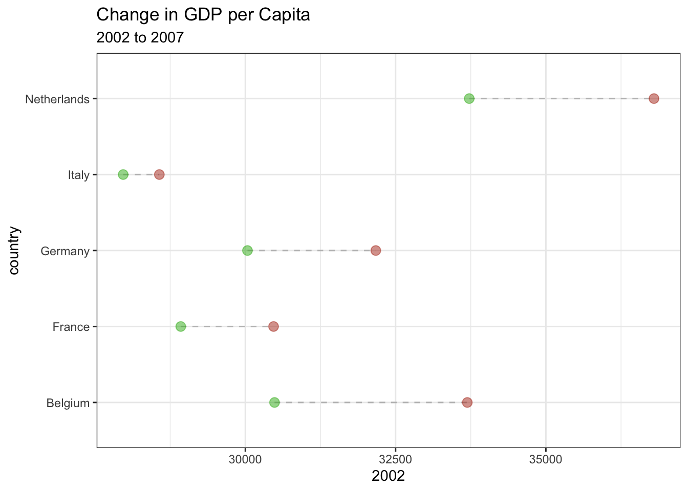
This principle states that if objects are connected, we perceive them as a unified entity. This is clearly demonstrated in the chart below: the connection between the first and second points helps to guide us to consider the values together and make comparisons between them.
Exercise
Take the chart you did in the critique.
Prepare to explain it to the group for 2 minutes (you can just use what you wrote in the essay) Mention one of each of the following, and point out whether you think they are effective or appropriate:
- A geometry
- An aesthetic
- A gestalt principle
