Code
library(tidyverse)

gapminder_df =  read_tsv('gapminder_df.csv') |> filter(continent!= 'FSU')

gapminder_df |>
  filter(year == 2002) |>
  ggplot(aes(x = lifeExp, y = gdpPercap )) +
  geom_point()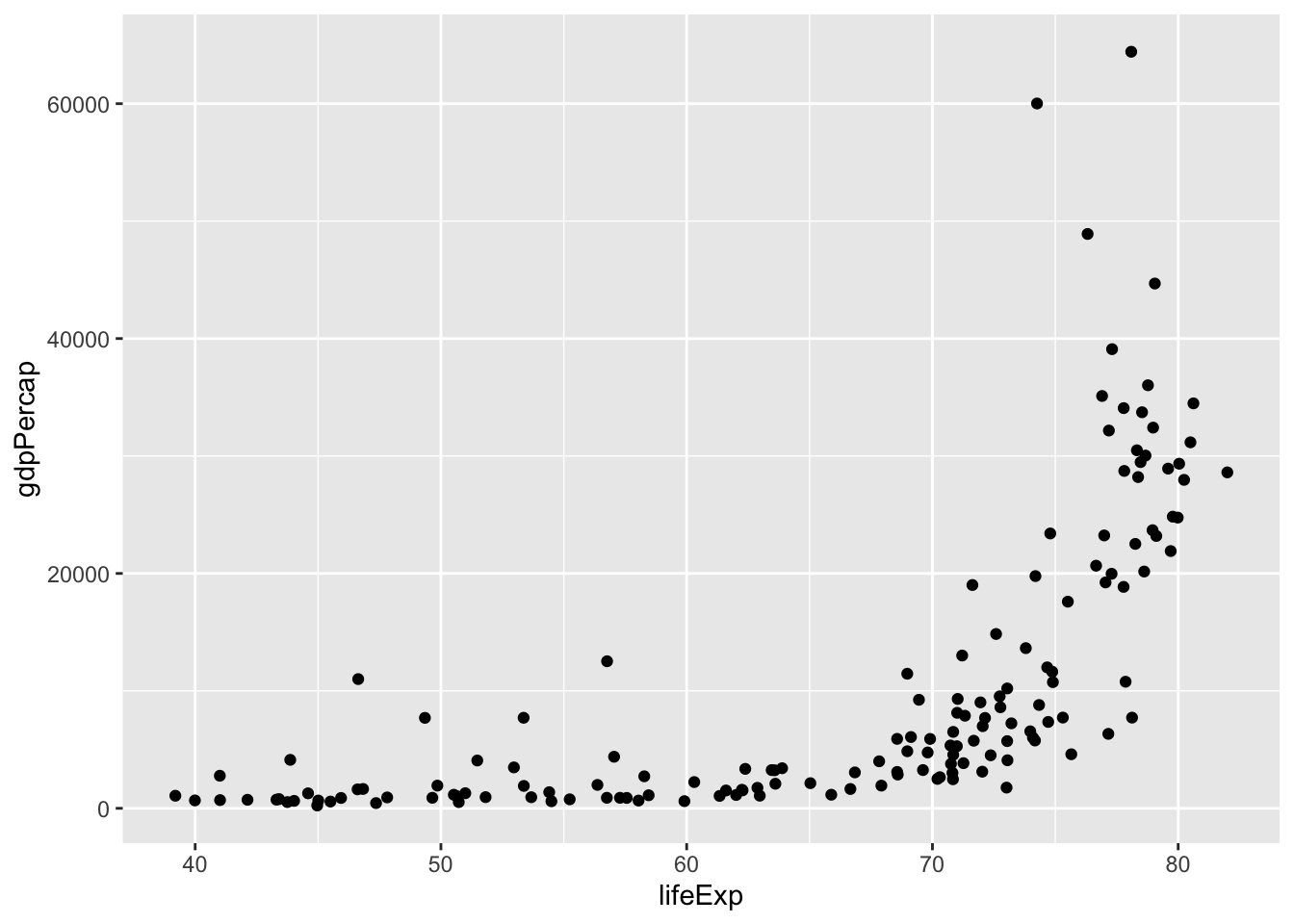
Understand basic principles of data visualisation
Know how ggplot2 works and the ‘grammar of graphics’.
Be able to define and list the key geometries and aesthetics and how they are used to make visualisations.
Be familiar with the basic chart types and how they are implemented in ggplot2
This week, we’ll begin working with data visualisations. We’ll introduce in a very general sense the different ways we can draw things with data visualisation software. We won’t think too much about the specifics of making charts for different purposes - just get used to the general syntax and most common chart types.
To begin with, we should think about the purpose of data visualisation. Essentially, the purpose is to aid cognition, usually of large-scale or complex data which otherwise is difficult to grasp. Some examples of how it aids cognition include using infovis to:
Understand, explore and remember information
Take in large amounts of data at once
Make comparisons
Read millions of data points or understand complex structures (e.g. hierarchies or networks)
Understand temporal information, e.g. logic of going from earlier to later time
The reason data visualisation works is because our brains tend to make judgements about values based on visual elements. For example, if given two circles, one small and one big, and are asked which we think represents the larger value, you would likely pick the bigger one.
Similarly, we associate ‘hotter’ colours with larger values than colder ones.
We associate transparency or opacity with strength. And so forth..
We can use these principles in data visualisations. By mapping data to these visual elements, we can aid in the understanding of a given dataset by viewers.
Next week, we’ll take a closer look at some of the psychological principles behind why these work. For today, we’ll focus on the pratical aspects.
These visual elements can be broken down into geometries and aesthetics. Geometries are the basic geometric shapes, like circles, points, lines, and so forth. Aesthetics are the features of those shapes, like size, colour, and position.
In the next two parts of the chapter, we’ll look at the typical geometries available to us.
On this page we concentrate on the aesthetics.
There are many possible aesthetics, but some of the most commonly-found in infovis are:
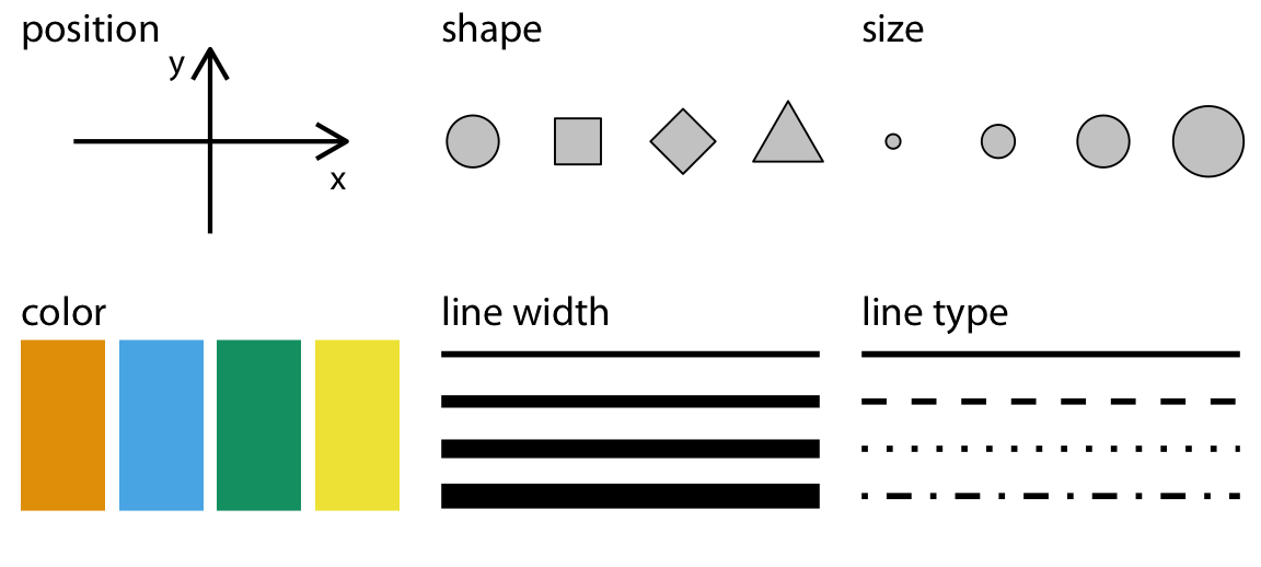
Another important one not pictured here is transparency.
We can use these aesthetics to tell lots of different stories within our data. For example, we can use them to indicate the magnitude of a value, to draw attention to different categories, or simply to highlight information we wish the viewer to pay attention to.
So how can we use each of these?
Most aesthetics work on either discrete or continuous scales. We’ll learn more about scales next week, but for now, you can think of scales as either representing sequential numbers (continuous) or distinct numbers or categories (discrete or categorical).
Which scale is suitable depends on the kind of data. Continuous data are things like age, height, or population, where the data might be any number from across a range. Discrete data are numbers where the value can only be one number or another, and not any value in between. Categorical data are data with a limited number of unordered categories, like gender, country, and so forth. A fourth type, ordinal, are categories where there is some inherent order, for example months of the year.
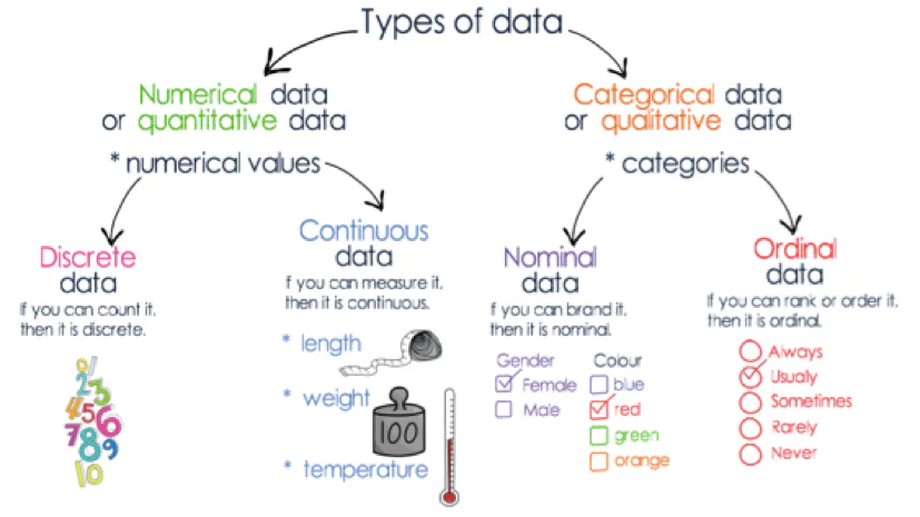
We have come across most of these data types in R already: values such as age in the passenger list are continuous (age could also be discrete if it was stored in full years); gender and place of embarking are both categorical. Categorical data are usually stored in columns with the string type (<str>), whereas continuous are stored as double (<dbl>). Discrete values may be stored as integers (<int>). Ordinal data in R is stored in a special data type, called a factor. Factors are variables that have a fixed and known set of possible values, and can be inherently ordered. We won’t really delve into factors on this course, but there are some situations where they are useful, for example if you want to reorder elements of a data visualisation.
Some aesthetics only work on one or the other (shapes can only represent categories, for instance). In other cases, the scale will work differently depending on whether it is applied to a discrete or continuous set of data. In the example of colour, below, a categorical scale is usually represented by distinct, unrelated colours, whereas a continuous scale is sequential range, running from yellow to green.
The difference between continuous and discrete scales on the colour aesthetic
Below are the aesthetics you’ll use most often in data visualisation, with some examples. The visualisations are made using the Gapminder dataset, which contains information on the GDP, life expectancy, and population of the world from 1952 until 2007. It is a useful dataset for demonstrations, though personally I think it presents (or at least is often used for) a reductive and overly-rational view of the world and how we measure progress!
You can view the code I’ve used to make the plots, which might be useful later, as a reference.
All data visualisations need to be positioned in some kind of space. In this course, that space will be 2D, but 3D visualisations are also possible. These are generally given as x and y coordinates. In the example below, position is used to highlight a relationship between two variables. This dataset graphs the GDP per capita on the x axis and the life expectancy on the y axis.
The resulting scatterplot shows the relationship between the two variables. It’s not linear, but in general, the higher the GDP, the higher the life expectancy.
library(tidyverse)
gapminder_df = read_tsv('gapminder_df.csv') |> filter(continent!= 'FSU')
gapminder_df |>
filter(year == 2002) |>
ggplot(aes(x = lifeExp, y = gdpPercap )) +
geom_point()
Size is often mapped to amounts or magnitude (we naturally understand that these two things map together). If we take our chart above and map the size variable to the population, the viewer will grasp intuitively that larger sizes equal a larger population. To make this relationship even clearer, we should include a legend.
options(scipen = 999999)
gapminder_df |>
  filter(year == 2002) |>
  mutate(pop = pop/1000000) |>
  ggplot(aes(x = lifeExp, y = gdpPercap, size = pop)) +
  geom_point() +
  scale_size_area(max_size = 10) +
labs(size = "Population (in millions)") 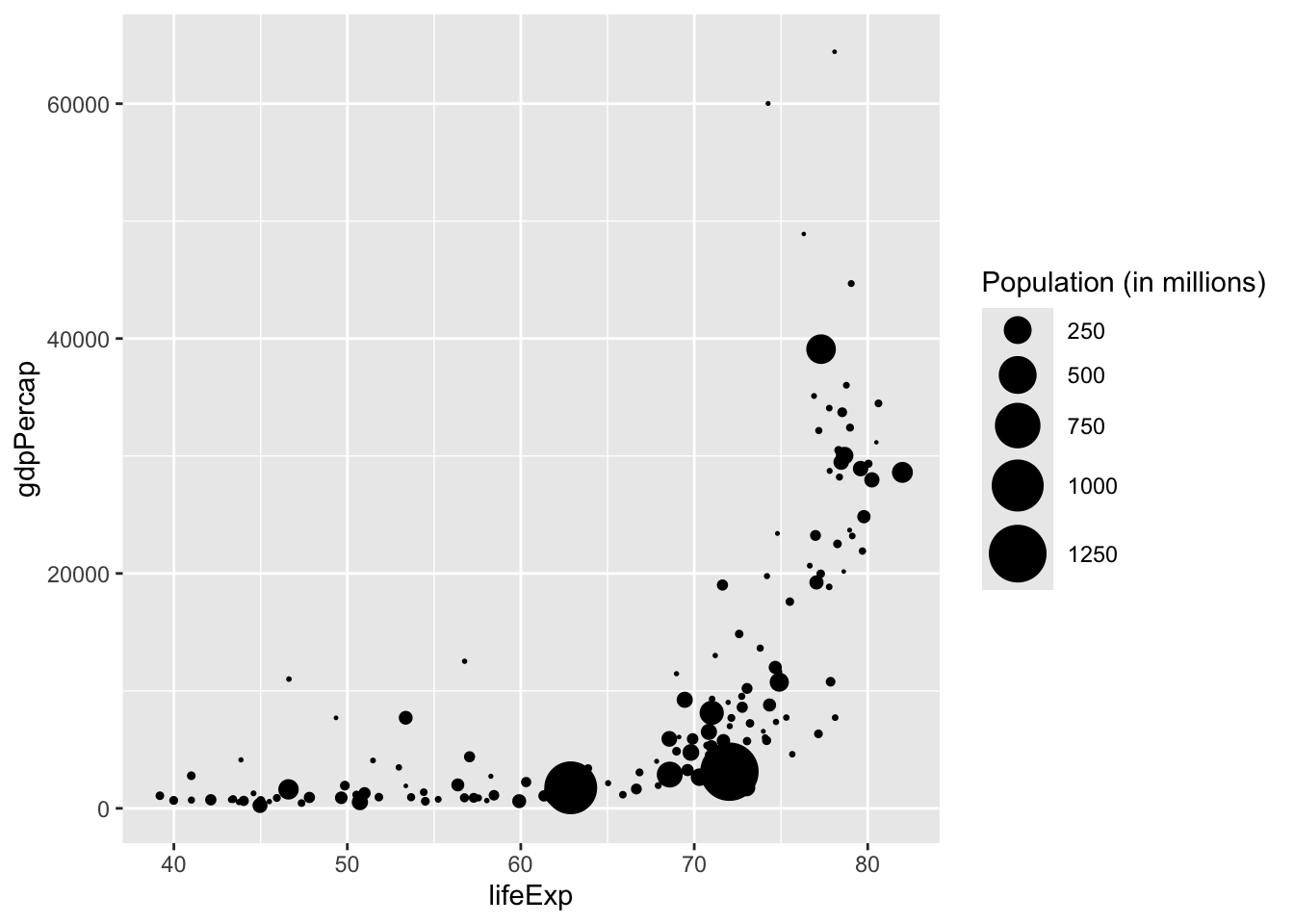
Colour is a very useful aesthetic and can have many uses. One key one is to group data together, for example mapping the colour to the continent. This helps a user to quickly see differences in the data between the continents.
gapminder_df |>
  filter(year == 2002) |>
  mutate(pop = pop/1000000) |>
  ggplot(aes(x = lifeExp, y = gdpPercap, size = pop, color = continent)) +
  geom_point() +
  scale_size_area(max_size = 10) +
labs(size = "Population (in millions)") 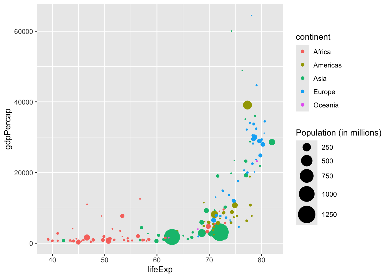
Shape can be used similarly to colour to show different groups or categories.
gapminder_df |>
  filter(year == 2002) |>
  mutate(pop = pop/1000000) |>
  ggplot(aes(x = lifeExp, y = gdpPercap, size = pop, shape = continent)) +
  geom_point() +
  scale_size_area(max_size = 10) +
labs(size = "Population (in millions)") 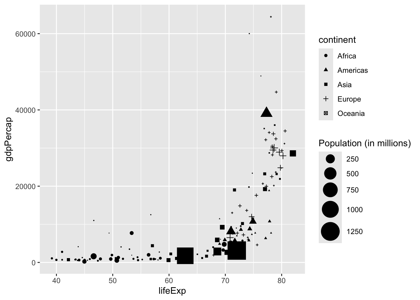
Linetype isn’t so widely used in scatterplots, but can be used in other types to distinguish between groups or categories:
gapminder_df |>
  filter(country %in% c('Netherlands', 'France', "Germany", "Italy", "Belgium")) |>
  count(year, country, wt = lifeExp) |>
  ggplot() +
  geom_line(aes(x = year, y = n, linetype = country)) +
  labs(title = "Life Expectancy", subtitle = "Select Countries, 1952 - 2007") +
  theme_bw()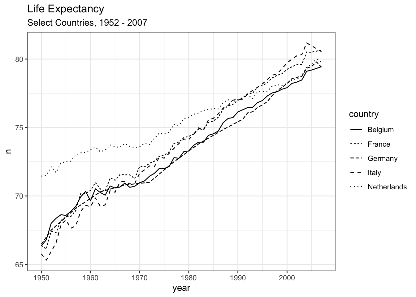
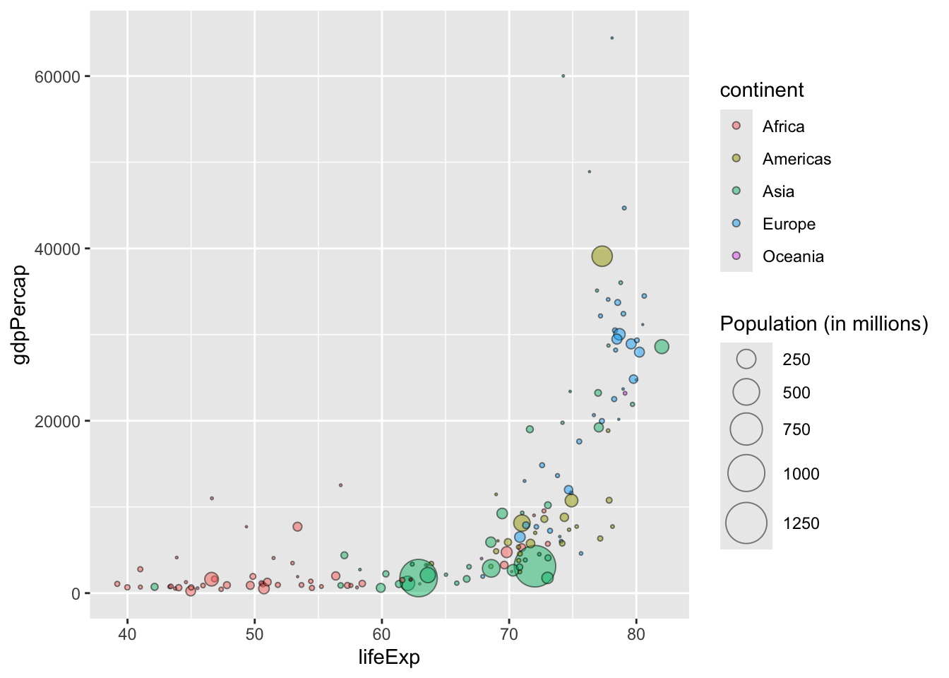
Transparency can be mapped to data, but it is more useful used as a way to help with ‘overplotting’: when shapes are drawn on top of each other and difficult to distinguish. Here, we set the opacity to 50% (and add an outline), to make it possible to see the points which overlap with each other.
gapminder_df |>
  filter(year == 2002) |>
  mutate(pop = pop/1000000) |>
  ggplot(aes(x = lifeExp, y = gdpPercap, size = pop, fill = continent)) +
  geom_point(alpha = .5, pch = 21, color = 'black') +
  scale_size_area(max_size = 10) +
labs(size = "Population (in millions)") 