29 Colour and size scales
Color scales
The other key scale we will work with are colour scales. As with position, ggplot2 will pick default scales, which we can change if needed.
Remember the data types from last week? How colour is mapped to data, and which scales we can and should choose, is highly dependent on the data type given. Remember too that colour is found either in the colour aesthetic (for example for geom_point) but also in the fill aesthetic (such as the fill colour of a bar chart). Both work in the same way, but use a slightly different scale name.
Mapping categorical data will result in a discrete scale, by default scale_colour_discrete or scale_fill_discrete. With this scale, ggplot will choose colours with the aim of making them as distinct from each other as possible.
Mapping numerical data will result in a continuous scale, by default scale_colour_continuous or scale_fill_continuous. With this scale, ggplot will choose a colour range where one end of the hue or saturation will be mapped to high values and the other end to low values.
Let’s see how this works by mapping the fill in a bar chart to numerical and categorical data variables. To demonstrate we’ll take the Gapminder dataset from last week and choose a small number of countries:
The lifeExp variable is numerical, so if we set it to the fill aesthetic, ggplot2 will pick a continuous scale. The default scale maps high values as light blue and low values as dark blue.
The continent variable is categorixal, so if we set it to the fill aesthetic, ggplot2 will pick a discrete scale. The default scale depends on the number of categories: up to seven, and ggplot will choose colours spaced as far apart on the colour wheel as possible; more than that, and ggplot will use a rainbow palette.
Note that in order to communicate how values have been mapped to colours, ggplot automatically includes a legend, which looks different depending on the type of scale used.
There are lots of ways to choose different colour scales. In all these cases, the word colour is interchangeable with the word fill within the names of the scales.
This is done slightly differently depending on whether it’s a continuous or discrete scale:
Continuous scales
Use ‘built in’ scales
One way to alter the continuous colour scale is to specify a ‘built in’ one, either from ggplot2 or from another package. One example is scale_fill_viridis_c, which is apparently good for perception and takes into account color vision deficiencies:
Create a scale from a palette
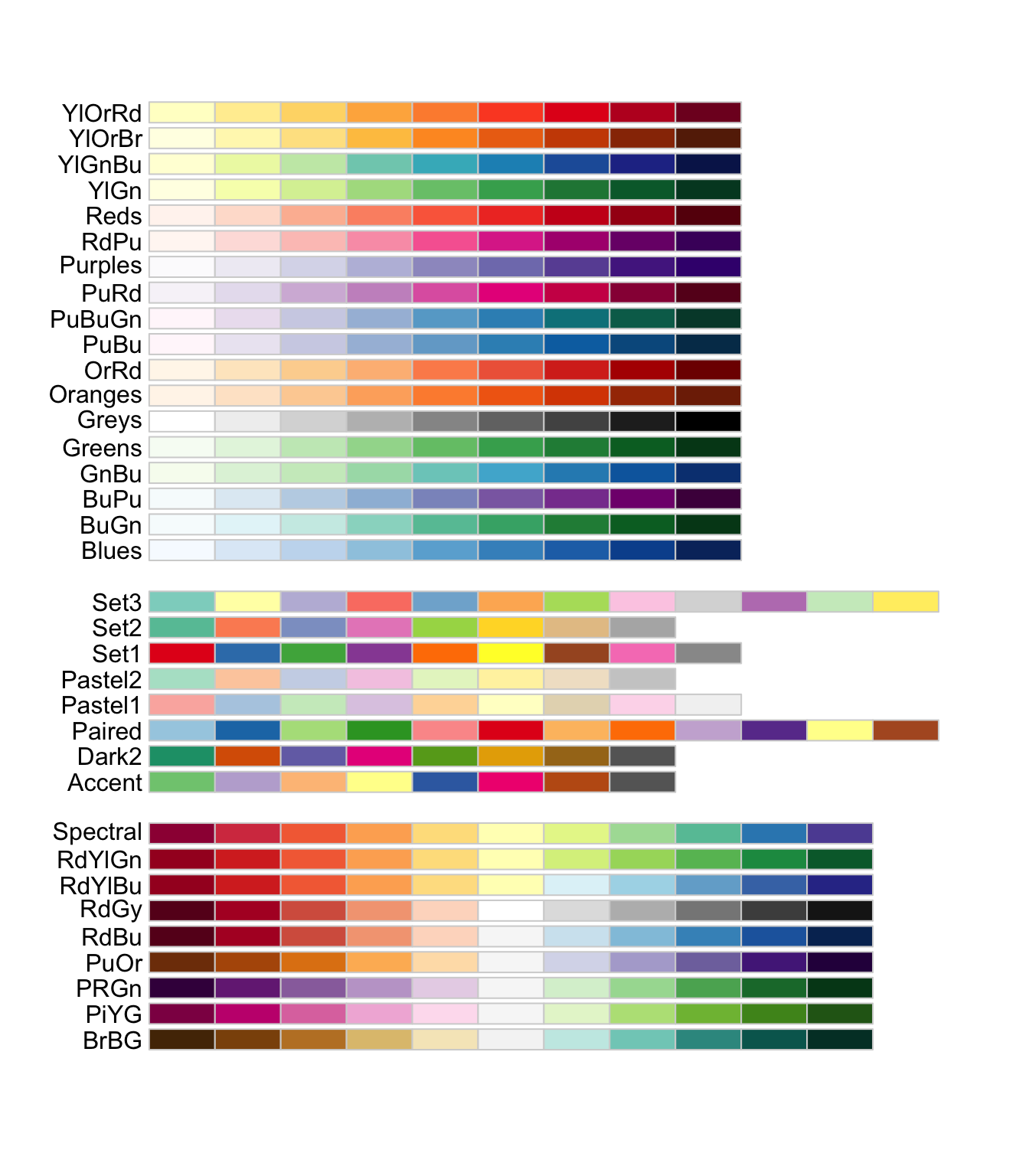
Use scale_color_distiller to specify that ggplot should take a particular palette and distribute the values evenly along it. This is the full list of palettes and their codes.

To use, simply pass one of the codes to the palette = argument of scale_fill_distiller:
Try it yourself: Change the palette of this chart to ‘Greens’:
Create your own continuous scale
You can also ‘make your own’ palette. For instance, scale_color_gradient will create a gradient colour scale in between two colours you specify. A large list of R colour names can be found here: https://r-charts.com/colors/
An alternative is to use scale_gradient2(), which allows you to specify 3 colours, a low, mid and high. The function will create a scale similar to above but with a specified midpoint:
Discrete scales
Discrete scales can also use ‘built in’ scales. The version of scale_fill_viridis for discrete scales is called scale_fill_viridis_d:
Create from a palette
The equivalent method for picking a scale from an existing palette is to use scale_fill_brewer. Again, choose a palette from the list supplied above:
Fully manual scales
Finally, with discrete scales you can simply pick your own set of colours, using scale_fill_manual:
Size scales
The final scale which is useful to know is size. The most frequent use of the size aesthetic is to set the size of points in a scatterplot to a continuous variable.
The size scale is controlled by default by scale_size. This maps values to the area of a point, linearly.
On small tip is to replace scale_size with scale_size_area(), which ensure that values of 0 are mapped to zero. You can also set the max_size = argument within this scale to get a range of sizes you are happy with.
Adjusting the legend
As with position scales, we can set limits and breaks. In this case, we’ll see the change in the legend primarily.
To set the limit, specify within the scale_x_ or scale_y function you are using. In this, any values outside the limits will be coloured by a default NA value, in this case grey.
Set the breaks using the below:
You can make changes to the legend in other ways, using the guides() function. Here are some examples:
Use barheight to set the height of the legend (you can use barwidth to set the width):
Change from vertical to horizontal:
Changing the position and other visual aspects of the legend is done within themes, which we’ll cover next week.
