library(tidyverse)
bellevue_dataset = read_csv('bellevue_almshouse_modified.csv')

df <- bellevue_dataset |>
  group_by(date_in) |>
  summarise(n = n())

df |>
  ggplot() +
  geom_line(aes(x = date_in, y = n))
Scales for dates and times are a bit more complicated but worth understanding because they are so widely used in humanities data.
Dates in R are stored as a special Date class. If R has recognised a column in this date format, you can format the axis labels and tick marks in ways which make more sense for dates.
The Bellevue Almshouse dataset we used previously stores dates in this class:
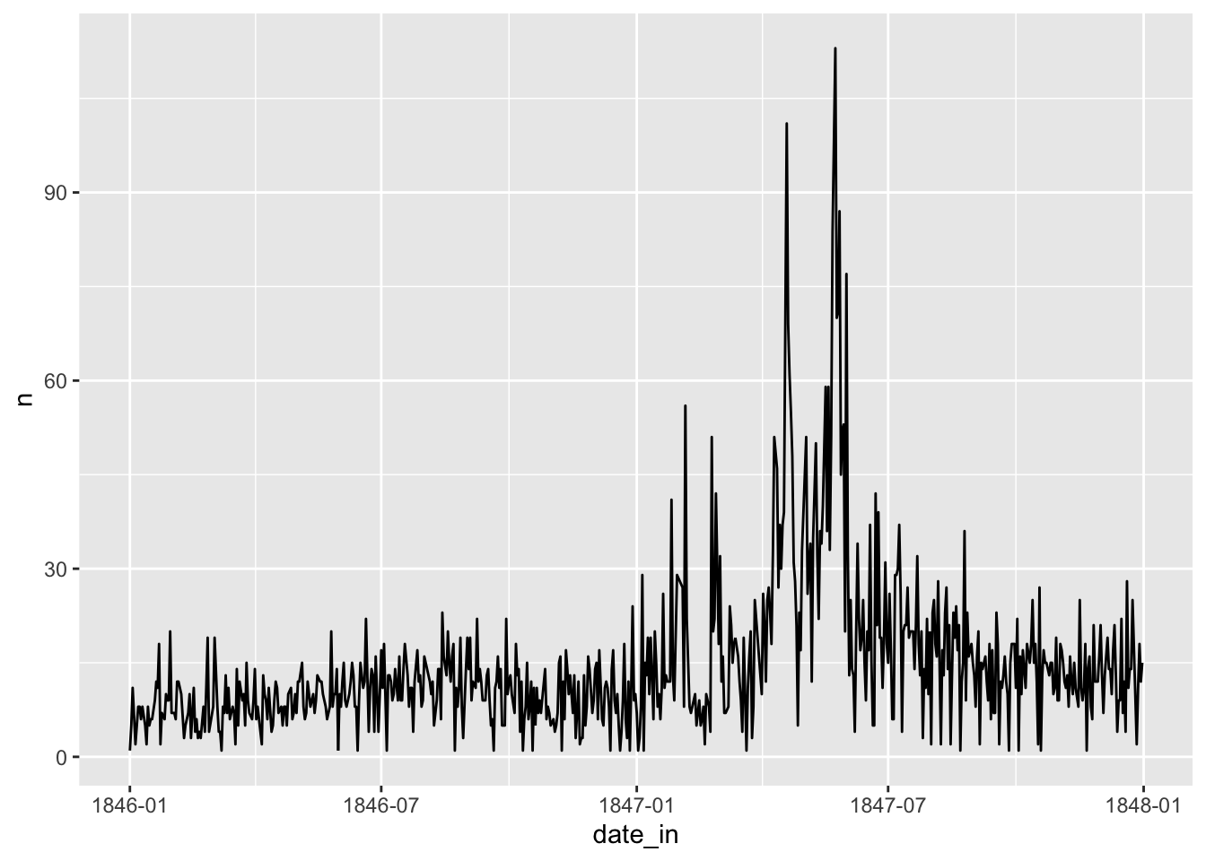
Let’s make a line chart of the date of admission:
library(tidyverse)
bellevue_dataset = read_csv('bellevue_almshouse_modified.csv')
df <- bellevue_dataset |>
group_by(date_in) |>
summarise(n = n())
df |>
ggplot() +
geom_line(aes(x = date_in, y = n))
ggplot picks a set of axis ticks and labels it thinks will work best for this scale. To change these we use the default scale for dates, scale_x_date.
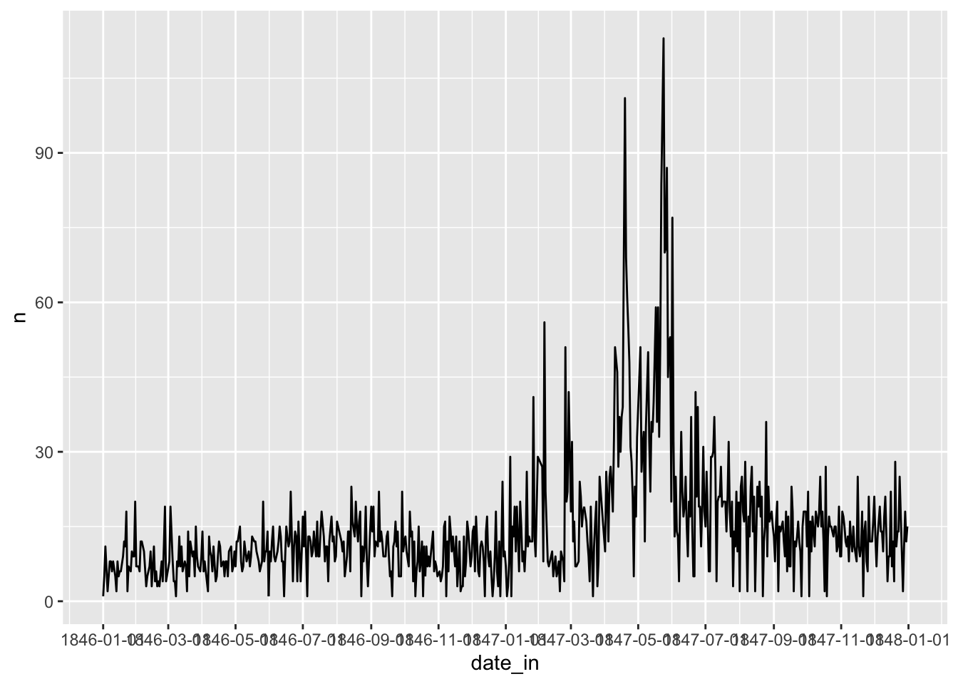
As with scale_x_continuous, we can set the minor and major breaks, except we can use more ‘date friendly’ units. Using the date_breaks argument in scale_x_continuous, you can pass any number and date unit to the scale axis. For instance, we could specify that every two months are shown with the following:
df |> ggplot() +
  geom_line(aes(x = date_in, y = n)) +
  scale_x_date(date_breaks = "2 months")
Simililarly, we can set the minor breaks to any date unit, using the argument date_minor_breaks.
df |> ggplot() +
  geom_line(aes(x = date_in, y = n)) +
  scale_x_date(date_breaks = "2 months",
               date_minor_breaks = '1 week')
Finally, you can highly customise the way that dates are labelled in the axis, by passing a set of codes to the argument date_labels. For instance, you can specify that the axis should show the abbreviated month plus the year without the century, with the following:
df |> ggplot() +
  geom_line(aes(x = date_in, y = n)) +
  scale_x_date(date_breaks = "2 months",
               date_labels = "%b %y")
The full list of labels is available here.